A monthly ad budget is easy. A client tells you they're spending $400,000 a month and you spend $400,000 a month. Done.
Pacing is hard. A client tells you they're spending $400,000 a month and you have to land at $400,000 by the 30th, plus or minus a thousand dollars, across roughly 300 active campaigns split unevenly across Meta, Google, LinkedIn, and TikTok, each with its own cadence, weekend behavior, day-of-week curve, and tendency to suddenly burn through a daily cap on a Tuesday for reasons nobody can explain.
If you're not watching pacing, you find out on the 30th that one campaign ran out of budget on the 22nd while another one is sitting at 60% utilization and ate the rest. The total is fine. The mix is wrong. Three campaigns over-delivered, eight under-delivered, and the marketing team's plan for the month didn't match what actually happened.
The Daily Pacing layer in the dashboard is the answer to that problem.
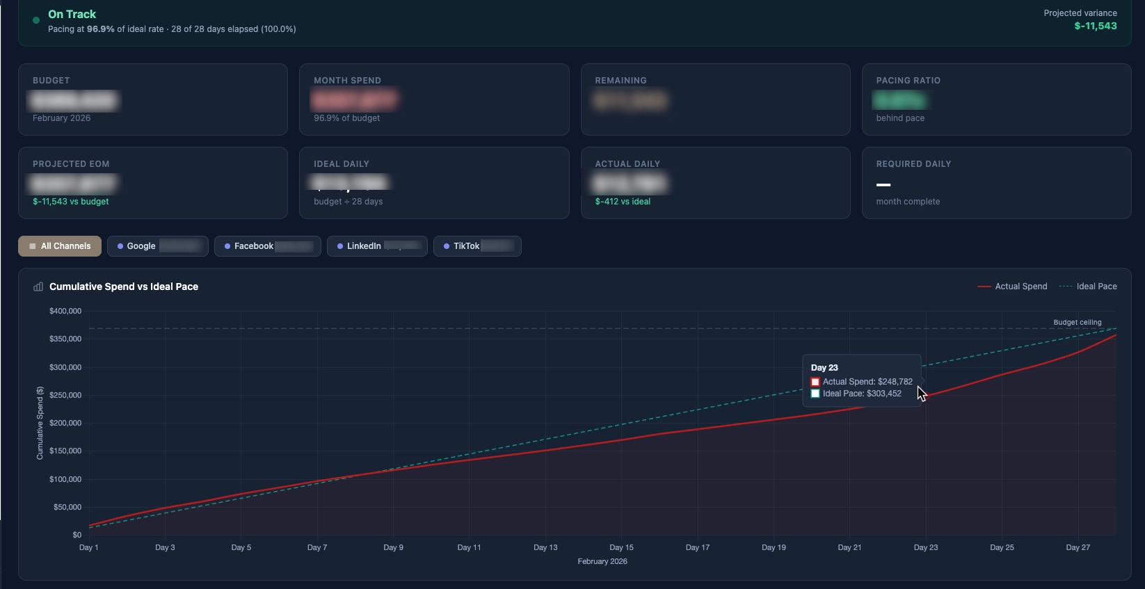
In the graph above, you can see that the campaign initially overspent on a daily basis. The campaign manager was able to scale the spend back effectively and then tighten the gap during the final week of the month, ultimately closing at 96.9% of the monthly ad spend target.
What pacing actually is
The naive version of pacing is "spend evenly across the month." Day 1 should be 1/30th of the budget. Day 15 should be 50%. Day 30 should be 100%. If you're at 60% on day 15, you're "hot." If you're at 40%, you're "cold."
This is wrong in three ways.
First, ad platforms don't deliver evenly. Weekends are different from weekdays. The first week of a flight is different from the last week. Some platforms front-load delivery, some throttle the start to "learning," some throttle the end to make sure they hit your daily cap on the final day. A campaign that spent linearly would actually be the unusual one.
Second, "where you should be on day N" is not a single number - it depends on which days of the month have already passed. February has 28 days. October has 31. Weekend-heavy months pull the curve one way. Holiday weeks pull it another. The right denominator is "% of the working days in the month that have elapsed," not "% of the calendar days."
Third, and most important, a monthly target is a sum of campaign targets, not a campaign target itself. If campaign A has a $50K monthly target and campaign B has a $25K monthly target, "is the account pacing well?" is the wrong question. The right questions are "is campaign A pacing well?" and "is campaign B pacing well?" - and the account aggregate is just the sum of those.
The two numbers that matter
Every campaign in the dashboard gets two numbers computed daily:
Expected-to-date. Given the monthly target and the working days elapsed, where should this campaign be by today? This is a forward calculation: target × (days elapsed / total working days in the month).
Actual-to-date. What has this campaign spent so far this month? This is a sum query against the campaign-rollup table.
The ratio of the two is the pacing factor:
pacing_factor = actual_to_date / expected_to_date
If the ratio is 1.00, the campaign is exactly on pace. If it's 1.30, the campaign is 30% hot. If it's 0.70, the campaign is 30% cold. Color-code those: green between 0.90 and 1.10, amber between 0.75 and 1.25, red outside that band.
Across 300 campaigns this becomes a triage list. Every morning the marketing team opens the pacing report, sorts by pacing factor descending, and the top of the list is what's hottest. They scroll until they hit green. Then they sort ascending and look at the bottom of the list for the coldest campaigns. Two glances, ten minutes, every campaign that needs attention is identified.
Forecast vs target
The pacing factor tells you where things stand right now. What it doesn't tell you is where they'll land at the end of the month if nothing changes.
The forecast is a second number, calculated by extrapolating the current daily run rate forward:
days_remaining = working_days_in_month - working_days_elapsed
projected_spend = actual_to_date + (current_daily_run_rate × days_remaining)
projected_delta = projected_spend - monthly_target
This is what the marketing team actually acts on. "Campaign X is 12% hot today" is informational. "Campaign X will overshoot its monthly target by $4,200 if we don't adjust" is actionable.
The forecast column on the pacing report shows projected_delta colored red (overshoot) or blue (undershoot), with the magnitude. Sort by projected_delta descending to find the campaigns most likely to blow past target. Sort ascending to find the ones most likely to leave money on the table.
Why working days, not calendar days
Most ad platforms have meaningfully different weekend behavior than weekday behavior. Some industries are mostly weekday (B2B Google Ads). Some are weekend-heavy (consumer Meta retargeting). Some are flat (display campaigns running 24/7).
For pacing math, we needed a denominator that matched the deliverable days in the month, not just the calendar days. The working-days approach treats Saturdays and Sundays as half-weight days by default, with per-campaign overrides for clients where weekends are critical or absent.
This is one of those quiet decisions that's easy to skip past in the spec and end up regretting. The first version of the pacing tool used calendar days. Every Monday morning the team would see a wave of "hot" campaigns that were actually fine - they'd just under-delivered on Saturday and Sunday and the math was treating those days as fully-paced. Switching to working days made the red/green flags actually correspond to "something is wrong."
Cross-platform comparison is harder than it looks
Within one platform, pacing math is straightforward - the cost field is comparable, the budget field is comparable, the daily delivery is observable. Across platforms, three subtle problems crop up:
Meta and Google compute "spend" differently. Meta's reported spend is gross of platform fees. Google's is net of credits. A $1,000 spend in Meta and a $1,000 spend in Google aren't always strictly comparable for budget purposes. The dashboard normalizes by treating reported spend as authoritative and ignoring the metadata - "what the platform's billing UI says you spent" is the only number that matters for pacing against a target.
LinkedIn reports in different currencies depending on account setup. Edge case, but real. The dashboard has a per-account currency multiplier that's applied at the ingestion layer so the campaign-rollup table is always in CAD. Without it, a LinkedIn campaign billed in USD would look 40% under-paced on every report.
TikTok updates intraday spend lazily. Some platforms refresh spend numbers every 15 minutes. TikTok sometimes lags a full day. If you compute "today's spend" at 10am from TikTok's API, you might be reading numbers from yesterday morning. The pacing math accounts for this by always evaluating "actual-to-date" through the previous full day - never including the current day's data, which is unreliable until midnight has passed across all platforms.
The "300 campaigns" problem
At three campaigns, you can pace by eyeballing. At 30 campaigns, you can pace with a spreadsheet. At 300, you cannot - the math is too easy to get wrong and the data refresh too painful to do by hand.
But you also can't just throw a giant table at the marketing team and call it done. 300 rows of pacing data is a wall of numbers with no signal. The dashboard's job is to compress 300 campaigns down to the 10 or 20 that need attention today.
The compression happens in three layers:
Layer 1: aggregate to the rollup the team operates at. Most agencies don't actually adjust campaigns - they adjust budgets. The pacing report's primary view rolls up to the budget unit (often a campaign group or location). 300 campaigns becomes 40 budget rows. Each row's pacing factor is the weighted average of its underlying campaigns, weighted by target.
Layer 2: filter to outliers. Default filter is "show me anything more than 15% off pace." Greens disappear. 40 rows becomes 8.
Layer 3: rank by forecast impact. Sort the 8 by projected end-of-month delta. The campaign that will overshoot by $4,200 sorts above the one that will overshoot by $300. The team starts at the top of the list and works down until they run out of time.
The flow from "300 active campaigns" to "the three things I should do today" is what makes the report useful instead of overwhelming.
What the team actually does with this
Every morning at 9am the pacing report is the second thing the marketing team opens (after their email). For each red or amber row at the top of the list, they make a decision:
- Hot, intentional: an event is driving traffic, the budget needs to expand to match. Push budget up via the platform UI, log a change request in the dashboard.
- Hot, accidental: a campaign with new creative is over-delivering because performance jumped. Pull daily budget down to bring pacing back in line.
- Cold, intentional: testing a new audience that hasn't ramped yet. Watch one more day, then expand if performance is acceptable.
- Cold, accidental: a campaign that paused for review and was never restarted. Restart, increase daily budget temporarily to catch up.
Each of those is logged as a change request in the dashboard so we have an audit trail of why the campaign was adjusted, by whom, and on what date. The change requests table is its own report - "what did we actually adjust this month" - that the client sees at the end of each month as part of the standard reporting deliverable.
Catch-up vs flat-rate after a change
One math detail that's worth getting right: when you adjust a campaign's daily budget mid-month, how do you reset the pacing target for the remaining days?
The wrong way: keep the original monthly target and assume the campaign needs to make up all the under-delivery in the days remaining. This frequently produces unrealistic catch-up rates that the campaign cannot achieve. A campaign that's $5,000 cold on day 20 with 10 working days left would need to spend $1,500/day for the rest of the month - which often isn't possible without burning auction efficiency.
The right way: when a budget adjustment is logged, the pacing math treats the new daily budget as authoritative going forward. The "expected-to-date" for the rest of the month is recalculated from the adjustment date, not from day 1. The original monthly target is preserved as a reference number, but the pacing math doesn't try to force the campaign to catch up to it artificially.
This produces saner color-coding after a budget change. A campaign that was 20% cold yesterday and got a daily budget bump today shows as on-pace today - which is the truth - rather than continuing to bleed red until it physically catches up.
What I would change
A few things on the next iteration of the pacing layer:
Predictive alerting, not just reactive reporting. Right now the report shows what's hot or cold today. The next version should email or Slack-alert the team when a campaign crosses a pacing threshold - red zone, projected to miss target by more than X% - rather than waiting for someone to open the dashboard. The data layer already supports it; the alerting hook is just not wired yet.
Auto-suggest budget adjustments. Given a hot or cold campaign with N days remaining, math out the daily budget adjustment that would land it exactly at target. Show that as a one-click "Apply Suggested Budget" button. This is a small UX improvement with a meaningful productivity multiplier - takes the math out of the team member's head.
Cross-campaign rebalance recommendations. If campaign A is $4,000 hot and campaign B is $4,000 cold within the same client account, the right move is often to move budget from B to A. The dashboard can spot these patterns and suggest the move. This is the next-best move after individual campaign adjustments - automated portfolio-level rebalancing.
But the core has held: across 300 campaigns and four platforms, the team can identify the campaigns that need attention each morning in about 90 seconds, and the dashboard catches the pacing mistakes that used to be invisible until month-end. That's the entire job.